Portfolio
Packaging Design
Fruit Snack Design
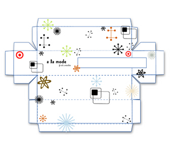
The goal of this project was to, as a group, design fruit snack packaging in order to learn how to create dyelines, nutrition labels and barcodes. Secondly, we were to come up with a name for an internal brand of fruit snacks for Target stores, a design of what the fruit snacks would look like and the design of what the packaging would look like.
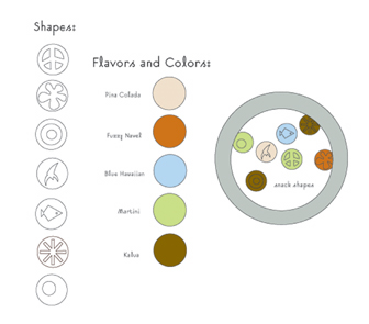
As a group we decided that the target audience for the fruit snacks would be adults instead of young children to be different from the norm and capture a whole new demographic. We decided that the design would be retro and the flavors would be names of alcoholic drinks. We did some research and came up with some popular 60’s & 70’s icons, patterns and colors to be incorporated throughout the design. The drink/flavor names were inspired by the colors.
My part in the project was to come up with the designs and flavors for the fruit snacks themselves. I ended up going further into the design of the actual fruit snacks than into the design of the packaging for the fruit snacks. I even created shapes for the fruit snacks out of Sculpey Clay. I did, however, help create some of the icons used in the packaging design in the process.
Date
April 2003
Course
Prepress Production
Instructor
Merri Fromm
Dimensions
Top & Bottom: 10 ¼" x 2 ¼"
Front & Back: 10 ¼" x 25⁄8"
Sides: 2 ¼" x 25⁄8"
Materials
Metal Tins & Sculpey Clay
Typefaces
Suburban, Helvetica & Universe


